Merkaba Music Tembo
A DISRUPTIVE RECORD LABEL WHICH HAS HIS HERITAGE AND SPIRITUALITY AS PRESENTATION CARD. CREATING A NEW GENRE AND POWERING INDEPENDENT ARTISTS.
Project Type & Role
re-Branding / Visual - brand Designer
Tools Used
Figma, Photoshop

Merkaba Music Tembo, or MMT, is a record label established in 2018.
It produces artists and its own music. They've developed their own music genre called "Interdimensional music", which compiles a wide-range of music with some key characteristics that all music in this gender shares…
Every single one of the songs displayed in their catalogue have a healing and/or energetic intention,whether it's a specific frequency, that triggers a certain stimulus, or an ancient mantra used to clean bad energies from spaces. The transdimentional music exists to enhance the wellness of the listener through auditive experience.
Main challenge:
The main challenge of this project was to achieve a visual identity that could represent the interdimensional essence while being versatile enough to work when placed besides other brands in collab/lockup.
Concept:
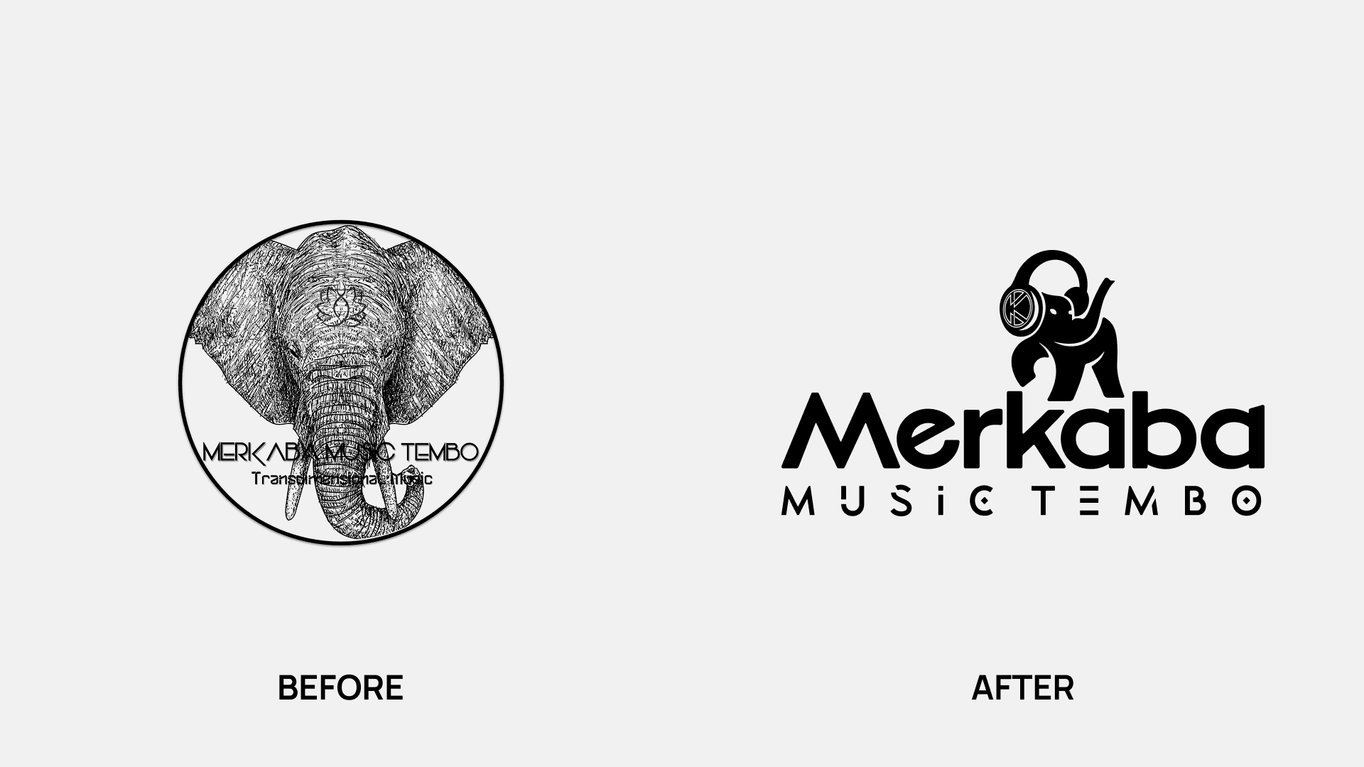
As MMT already had a visual identity I took it as an inicial base from where potenciate the essence and history that the brand already carried. I like to say that "In the history is the power" and this rebrand is a demonstration on how, rather than changing, a brand with value, essence and history evolves to achieve its best version.
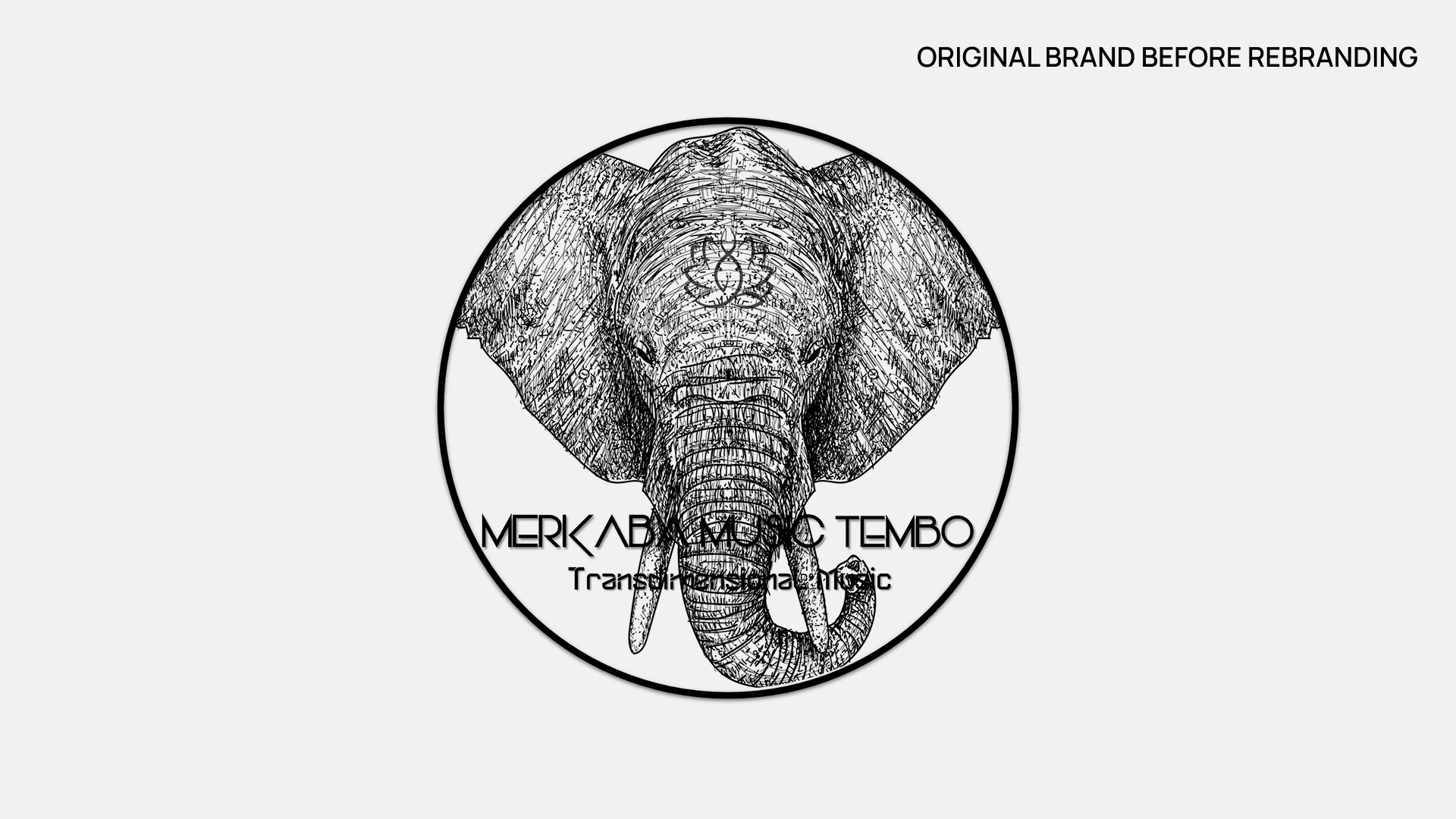
The original version of MMT is loaded with subliminal and emotional meaning. The elephant representing the ancestry, wisdom and spirituality; in many ancient cultures the elephant is a sing of good luck. And the lotus flower as a symbol of purity and spirituality as well.
Talking with the owner I realized how important the elephant symbol was for the brand narrative, as it even is present in the name:
Merkaba (An important symbol for high end spirituality), Music, Tembo ("Elephant" in Swahili, an African language).
After several discovery conversations we landed in some conclusions:
• The elephant is and will keep being the main character.
• The lotus flower becomes redundant as it shares the same meanings with the elephant.
• The client wants to go towards a more modern style, without losing its "heritage" simbolysm.
The approach:
Bearing in mind all the previous information, I wanted to bring to the table a proposal that links the ancient simbolysm with how the music is experienced nowadays.

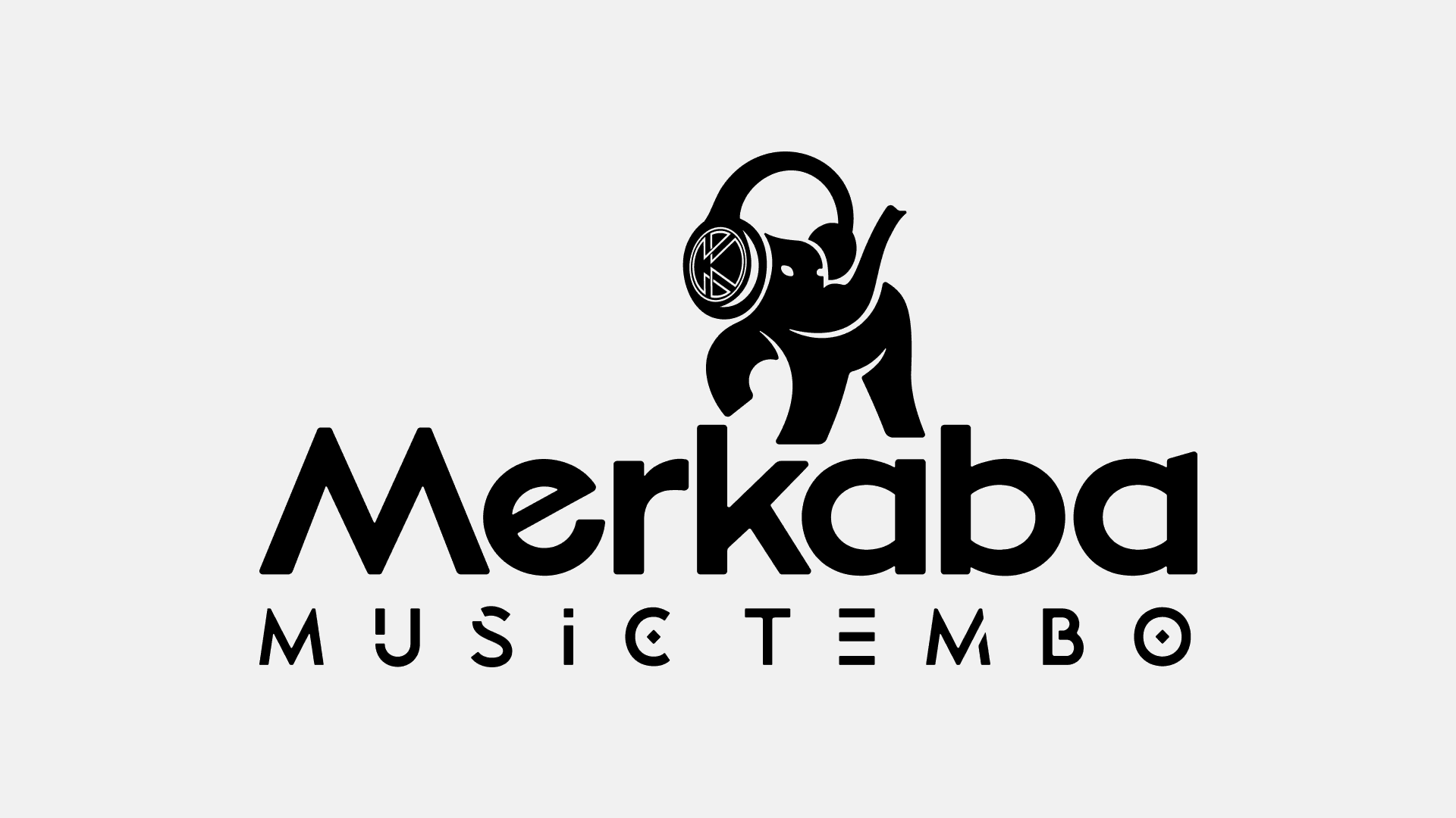
Thats how I reached to this symbol, a more polished elephant, as the ancient symbol, using headphones, as the symbol for the current technological era.
The symbol was crafted in a way that carries a meaning and works perfctly in almost any size, perfect for the wide range of applications that a logo for a record label will be placed on.
The elephant with the raised leg and trunk is a hint for good luck and prosperity all across the business path.
the Full 'mmt' breakdown:
A powerful symbol needs a powerful system that holds it as well.
Following the same concept as for the icon, the logotype that accompanies the isotype had to bring that same feeling of strength, shape, and heritage that the elephant recalls.
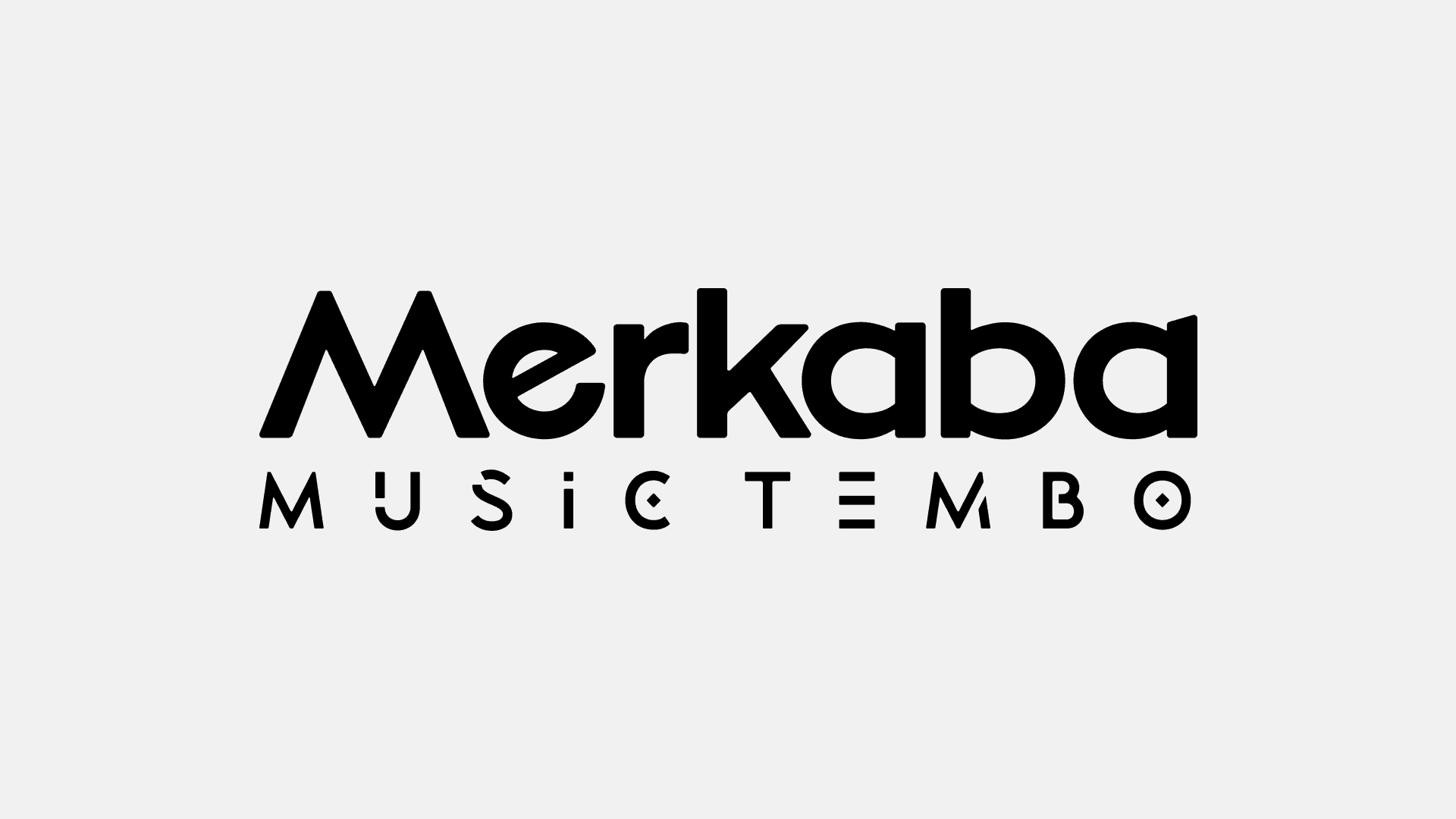
The final logotype became a clean and strong asset that conveys, just like the isotype, the linking between two eras. The word 'Merkaba' is composed by a clear and readable type that performs well in reductions. While the 'Music Tembo' is a reflect of the heritage style the brand wants to evoke, and its done by a tribal style type.
Both the isotype and logotype work together forming the main version for the brand identity.
This final version would be the most used across the touch points and it will be living with other several logos, the artists logos. The lockup use was a crucial part while developing the final output. They needed a logo that not only reflects their brand, but that elevates the whole composition when co-sharing a space.
After crafting the final logo the next step was to build the color palette and typographic system. But, after talks with the client and analyzing the current brand use and future projections I got to understand that the main placements where the logo would live is at the cover of each music releasement.
The color palette and brand types would only be used at "especial" moments, they didn't have the need to use it, and they're plans to future were to find partnerships with licensing agencies and film labels.

So I crafted a simple yet meaningful system that they can use at the moments they require to.
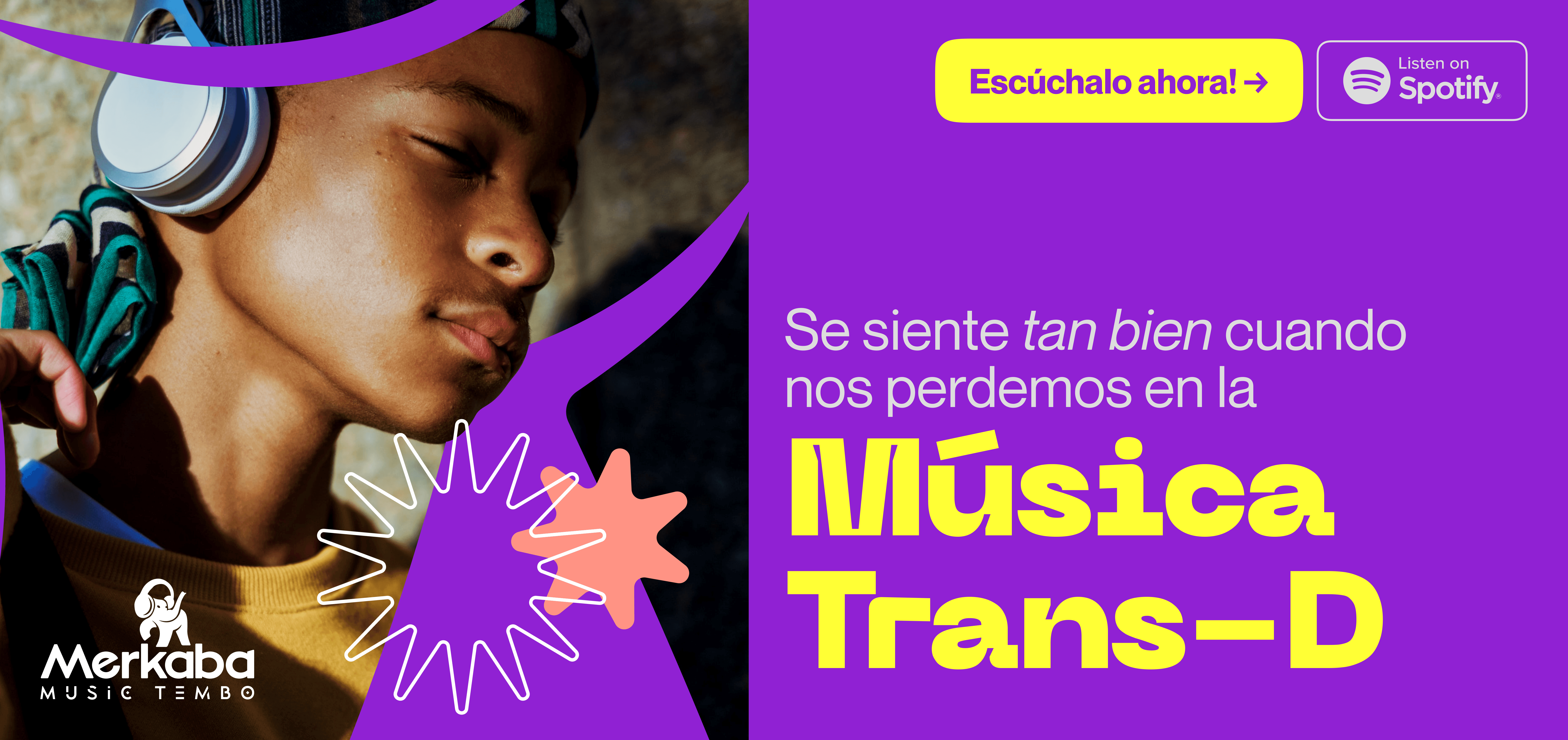
The color palette is formed by the Pan-African colors, in a more saturated tones. And the two type families represent the movement and energetic that you experience when listening to their music.
Here's an example of the system in action:
After this whole process, the brand became a powerful showcase of how brands with purpose, intention & history evolve throughout the time. And even though most of the time they perform behind scenes, now they get to make a difference through their work.
After the rebrand, MMT become more confident with its clients and presentations to potential partners. Their streaming rates grew, raising more than 3 million streams in total and more than 150k streams monthly, and now their being listened from more than 20 countries over the world.
This is Merkaba Music Tembo.
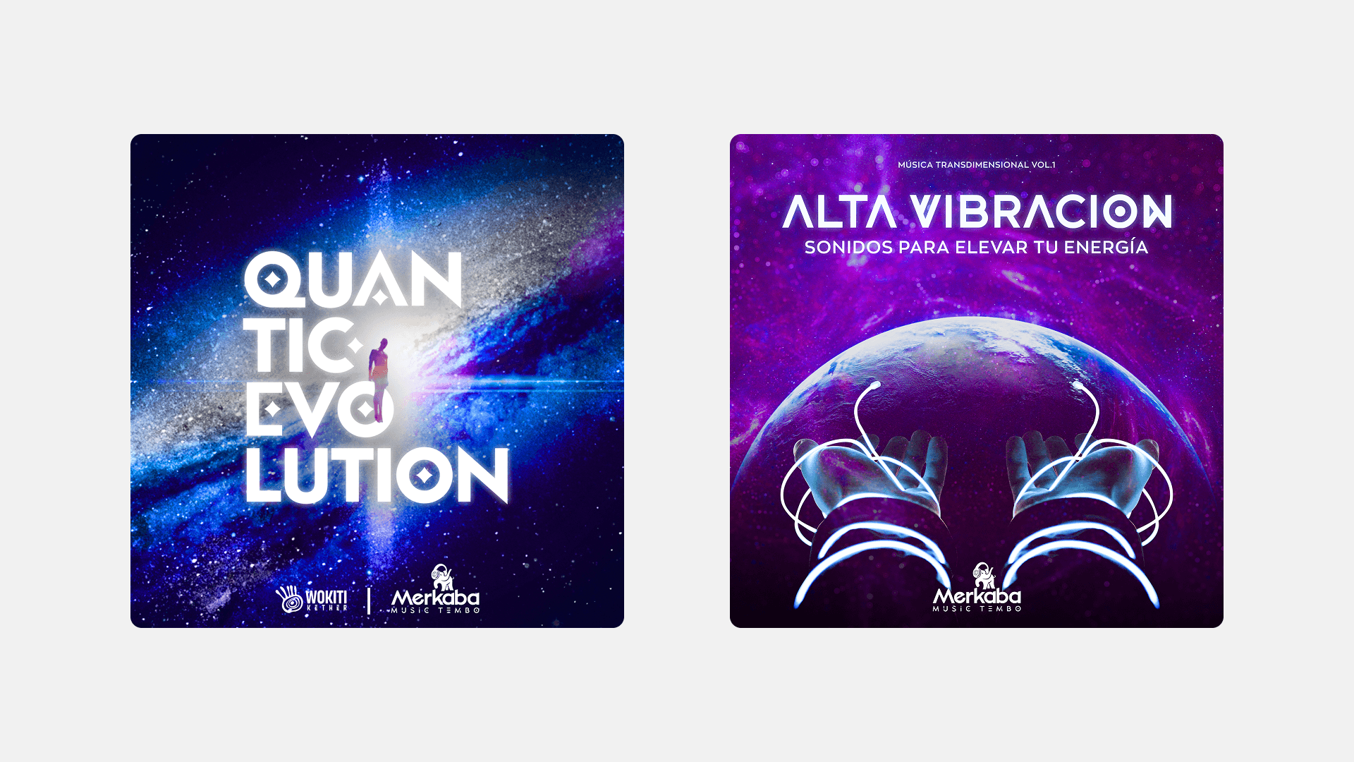
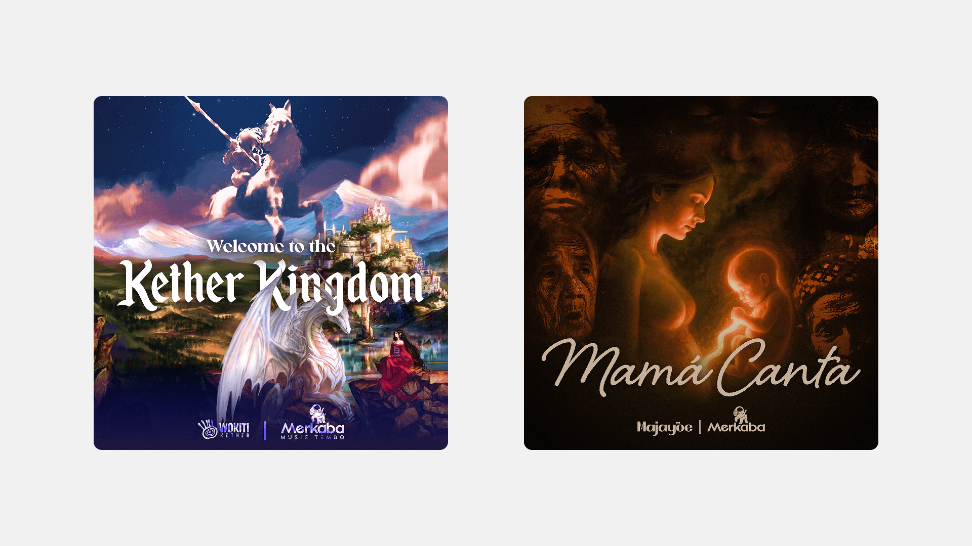
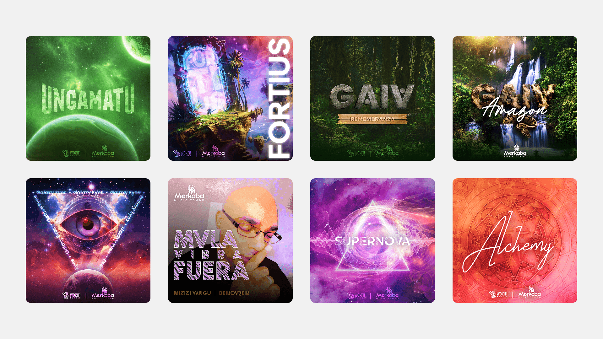
Some more design assets that i designed for this project:
As part of the work, I was asked to design the cover for several albums and singles, here are some of the final outputs.